Empathy Bytes logo

Exhibit #1

Empathy Bytes

Note: You can use the ? button (bottom right) to navigate the page too!

Overview

My Role

Frontend Web Dev Team Lead

UX Designer and Engineer

My Team

Project Supervisor

Backend Web Dev Co-Lead

Web Dev Team

Tools

Figma, Notion, Discord

Code

GitHub, GatsbyJS, React, GraphQL, Drupal

What is Empathy Bytes?

"Empathy Bytes is a student-run research project working with the GT library to focus on creating immersive technology and media centered around empathy and researching distinct communities connected to Georgia Tech."
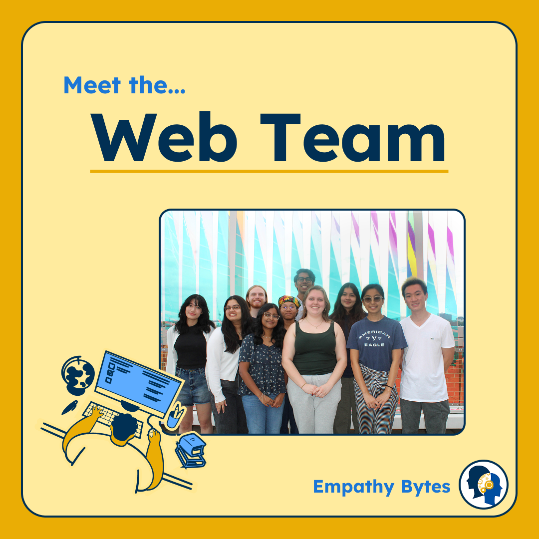
Meet the Empathy Bytes Web Team
Part of an Instagram post I created for our Web Team the previous semester when I was also part of the Media Team.
Meet the Web Team
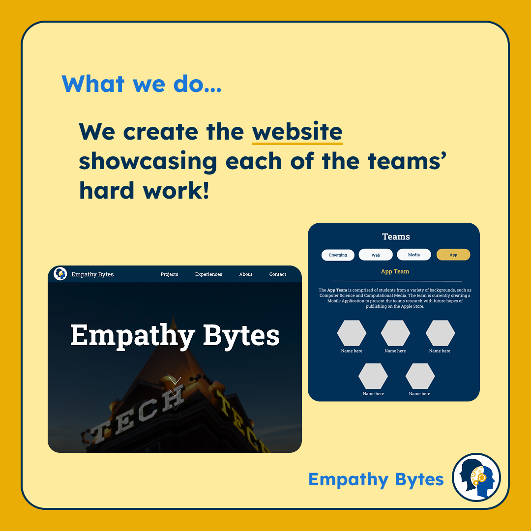
What the Empathy Bytes Web Team Does
We also showcase interviews, research, and each of the teams' progress.
What we do: We create the website showcasing each of the teams' hard work!

Overview

My Key Impacts

There were several things I achieved as a frontend team lead. Here are the numbers:

I also created an update style sheet and improved the team's programming experience through organizing the code.

Problem Space

Problem Space

What We Were Working With

I had to balance team leading, programming, and designing. This is why I had to organize and map out the problem space with two categories in mind: UX Design/Engineering and Leadership.

  • As a GT Vertically Integrated Project, members frequently joined and left each semester, limiting returning experience
  • Many of the new members had little experience with web development
  • Members had other classes to focus on as they were all GT students
  • I was still learning how to do web dev myself
  • External
    • Georgia Tech Librarians and Archivists
    • Students looking to join Empathy Bytes
    • People interested in EB's work and research
  • Internal
    • The Web Dev Team who are programming and managing the site
    • The other EB Teams (App, VR, Media) looking to showcase their work
  • Improving the Website
    • Refining the site's visual clarity and access
    • Updating the site to reflect EB's current projects
    • Finding shortcomings in the site's functionality
  • Improving Programming Productivity
    • Designing tickets for the team with clear instructions
    • Making it easier for future programmers to do work on the website
  • Basic functionality and formatting of all main pages and navigation
  • Some page redesigns ready for development
  • Design aesthetics and style of website
  • Foundational programming structure and organization

Problem Space

What We Had

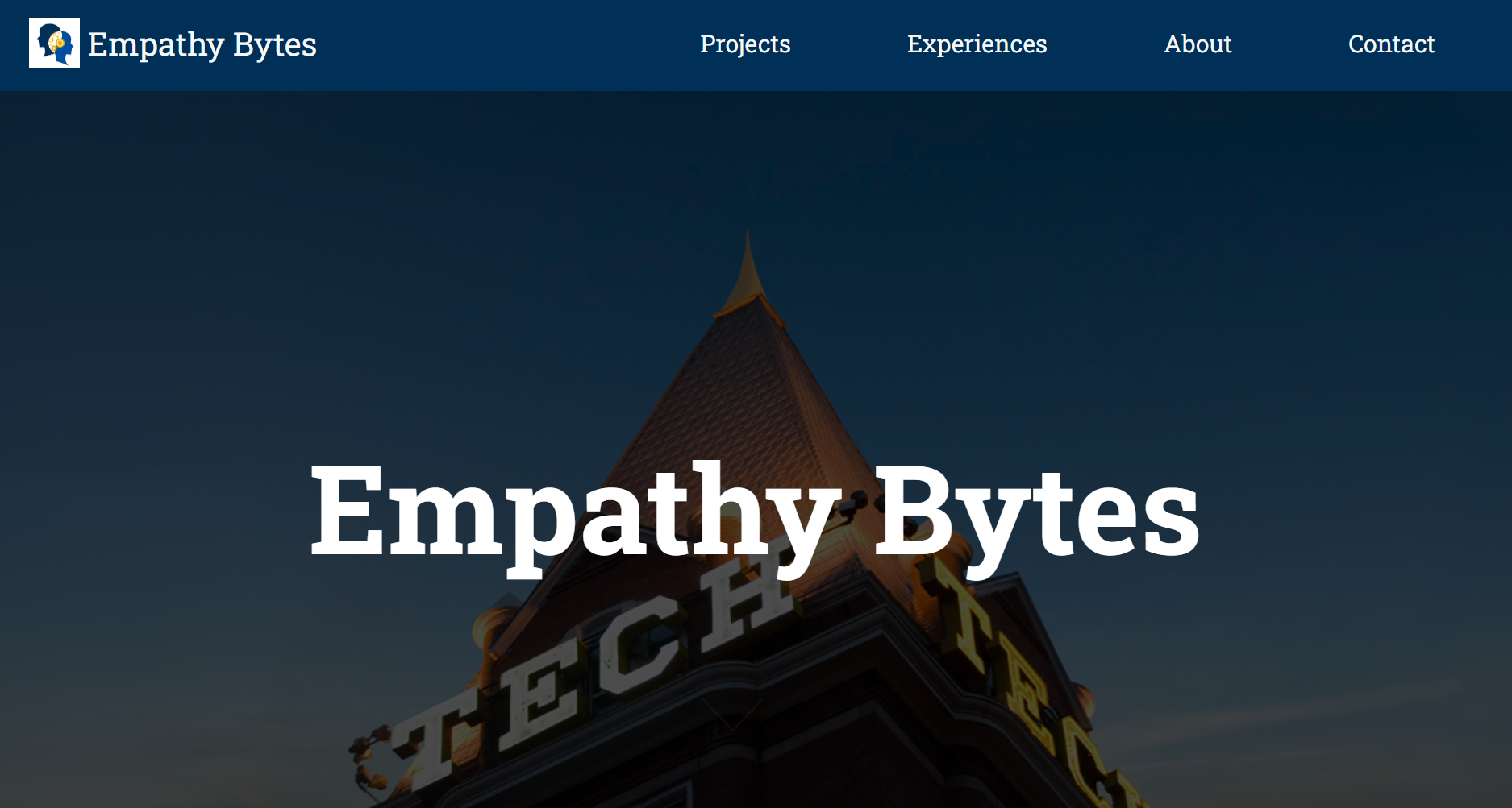
The Empathy Bytes website homepage
In the solutions section, you can see other changes to the navigation system.

In the previous semester, we also had updated the home page and navigation system.
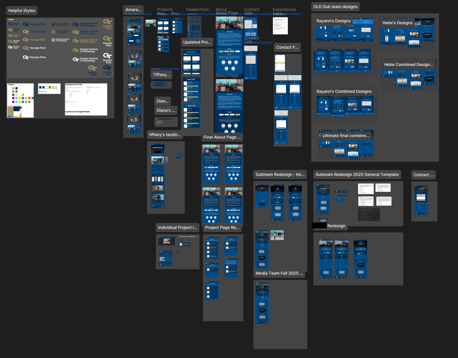
Figma design work for the Empathy Bytes website
As much as I wanted to change the Figma system, it was lower on my priorities. Luckily, there was still order to this chaos.

We used Figma for designing and had always made sure to cross reference when redesigning.

Problem Space

What We Wanted to Achieve

We decided to assign members to specific main goals so that all goals made progress and to ensure clear collaboration among those working on the same goal. Each person was given 2-3 goals to work towards.

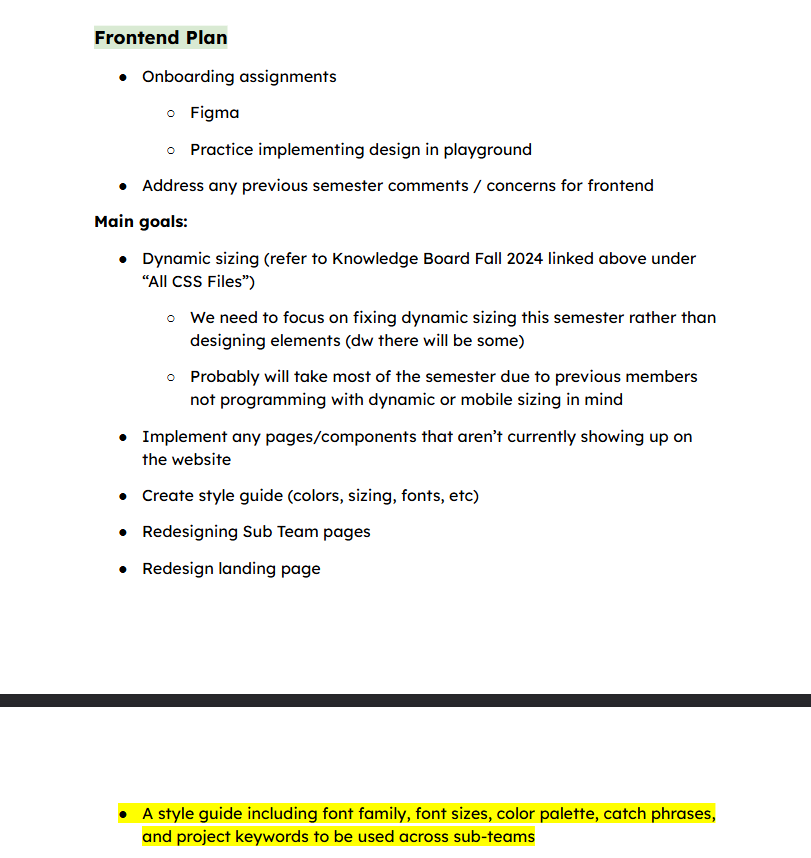
Empathy Bytes web team plan
Click to see a pdf of our rough plan!
Test image

Frontend

  • Dynamic Sizing
  • Redesign

Backend

  • Dynamic Updates
  • Backend Investigation

Both

  • Implementing Page Features and Redesigns
  • Miscellaneous
  • Onboarding

Problem Space

Key Design Issues

As much as I would have liked to build new features, there were a couple of issues that were long overdue...

Also, hover the pictures to learn more!Also, click on the pictures to learn more!

Unfriendly Mobile Interface

Problem:

Previous members did not use dynamic sizing units that resize elements based on screen size while programming. This was esepcially problematic for visual clarity and navigatability for different screen sizes.
Unfriendly Mobile Interface

Unfriendly Mobile Interface

Problem:

Previous members did not use dynamic sizing units that resize elements based on screen size while programming. This was esepcially problematic for visual clarity and navigatability for different screen sizes.

Unused Components and Redesigns

Problem:

There were redesigns and unused components not currently implemented or polished. This was especially problematic for users accessing features and for the team to move on.
Unused Components and Redesigns

Unused Components and Redesigns

Problem:

There were redesigns and unused components not currently implemented or polished. This was especially problematic for users accessing features and for the team to move on.

Redesigning Old and Outdated Pages

Problem:

Since there was a lot of focus on the main pages, many of the sub-pages were severely outdated and still followed the first iteration of the site's style. This was especially problematic for both consistency and legibility since this old style was meant to be placeholders for a more established design.
Redesigning Old and Outdated Pages

Redesigning Old and Outdated Pages

Problem:

Since there was a lot of focus on the main pages, many of the sub-pages were severely outdated and still followed the first iteration of the site's style. This was especially problematic for both consistency and legibility since this old style was meant to be placeholders for a more established design.

Problem Space

Key Team Issues

The previous team structure was good enough for a group of 3-4 people. However, as the team and workload continued to grow past that, several things needed to change...

Also, hover the pictures to learn more!Also, click on the pictures to learn more!

Undefined Style Guide

Problem:

Although the site’s style was present, the lack of an updated and defined style guide led to guesswork for exact component sizing, colors, and styling. This was especially problematic for consistency.
Undefined Style Guide

Undefined Style Guide

Problem:

Although the site’s style was present, the lack of an updated and defined style guide led to guesswork for exact component sizing, colors, and styling. This was especially problematic for consistency.

Historically Unclear Ticket Instructions

Problem:

Tickets didn't define goals/constraints and developers had to often interpret requirements on their own or constantly ask leads for clarity. This was especially problematic for members that were new and/or inexperienced in web dev.
Historically Unclear Ticket Instructions

Historically Unclear Ticket Instructions

Problem:

Tickets didn't define goals/constraints and developers had to often interpret requirements on their own or constantly ask leads for clarity. This was especially problematic for members that were new and/or inexperienced in web dev.

Poor Communication

Problem:

Previously, members were largely left to their own devices, leading to little team interactions and participation. This was especially problematic for team dynamics and reports on accomplishments or problems.
Poor Communication

Poor Communication

Problem:

Previously, members were largely left to their own devices, leading to little team interactions and participation. This was especially problematic for team dynamics and reports on accomplishments or problems.

Solutions

Solutions

Solving Design Problems

For improving website user experience, we focused on feel and functionality. For each of these problems, I detail what I did personally within the "Learn More" button.
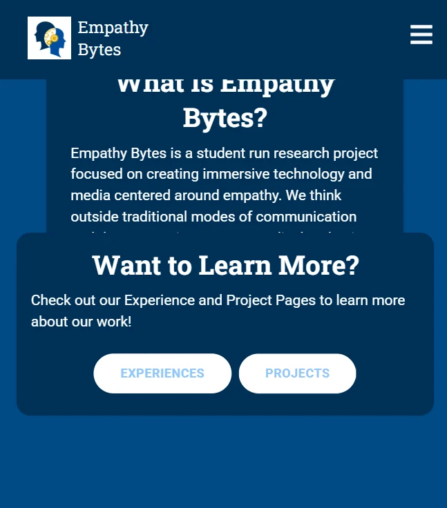
Picture of improper sizing
Overflow and overlap were common across all pages. I tried to fix as much as I could within the time we had.

Dynamic Sizing

Creating Dynamic Responsiveness...

Our biggest “feel” issue is the lack of mobile support since users are likely to check out EB through their phones. This problem would only worsen as the site continues to build if not addressed promptly.

Redesigning

Collaborating on and Reviewing Redesigns...

We created, reviewed, and then finalized designs in Figma before it moved to the implementation stage. We wanted to make sure we were also still updating the outdated portions of our website.

Implementing

Developing the Website Code...

In order to launch the website to production, we have to first program it. Implementation of our designs and ideas through code is the more technical part of our process but I won't go into that much here.

Solutions

Building Team Structure

To make as many of our design goals a reality, it was really important to improve our team structure.

Style Guide

Updating the Outdated...

One of the main goals for the team was to create an updated and detailed version of our style sheet. We questioned what stylings needed to be centralized and consistent across all pages.

Tickets

Creating Clarity in Tasks...

We used Notion for ticket making and delegation. At first, I wanted to use a simpler application but we found it best to stick to Notion for documentation and accessibility purposes since we already had been using it previously.

Communication

Increasing Team Participation...

Previously, all our forms of communication went really quiet and discouraged members from talking. As a lead, I had to find ways to enforce communication and encourage newcomers to ask questions.

Dynamic Sizing

Largest GoalImprove AccessibilityEnforce Good Coding Practices

Example of the landing page not have responsive and consistent layout sizing.
Creating Dynamic Responsiveness…

Our biggest "feel" issue is the lack of mobile support since users are likely to check out EB through their phones. This problem would only worsen as the site is built if not addressed promptly.

We got pretty far into this goal in the end but couldn't implement it all into the production site. This is why one of our team goals was to create a style guide and knowledge board for the next semester's team.

What I Did
As the team co-lead that mainly oversaw frontend, I had to address the misuse of sizing units that were scattered across all of the programming files. This included fixed pixel dimensions for layouts and size estimation among other responsive problems.
Deciding the Pages

With the time we had, we couldn't do all the pages. I collaborated with my fellow co-lead to decide which pages to make responsive (or at least rework designs).


The Questions...

Our choices:

  1. Home
  2. About
  3. Projects
  4. Contact
  5. Individual Team Pages

**plus navigation bar and footer

The navigation side bar for mobile showing all the pages.

Common Problems (and Proposed Solutions)

  1. Components didn't stretch/shrink based on screen size due to the code not using the appropriate sizing unitsSolution: Rewrite parts of the code with dynamic sizing units while still maintaining its original format and design

  2. Formats that felt good on desktop look crowded on mobileSolution: Redesign the mobile version of the pages and reduce length of descriptions and text

  3. Interactions were unfriendly to mobile usersSolution: Research good mobile UI/UX practices and implement them alongside the redesign
A screenshot of a previous code review where the reviewee did not use dynamic sizing. They said, "I might be testing your work wrong, but this what I see when I shrink to a smaller screen. I was expecting the footer shrink in terms of the screen width, but some of the footer gets cut off."A screenshot of a previous code review where the reviewee did not use dynamic sizing.

They said, "I might be testing your work wrong, but this what I see when I shrink to a smaller screen. I was expecting the footer shrink in terms of the screen width, but some of the footer gets cut off."
Steps Taken
Here are the steps I took as the frontend lead to make dynamic sizing happen:
An example of a ticket for Designing Mobile for the Experience Page

Step 1. Make Defined Tickets

For each page, I noted what the problems were and the types of changes that could improve mobile accessibility.

I also checked the code behind them to see if it followed proper programming practices and used dynamic sizing units (rem, vh, etc.) This way, I had enough information to create tasks to give to the rest of the team.

Step 2. Redesign for Mobile

Some pages only required code updates to their sizing units to improve readability whiles others required us to fully design its mobile version.

Example (right)

I decided to switch the Projects page to a 1-column layout to prevent each card from become too skinny. Several similar layouts also got this treatment for readability in addition to consistency.

Additionally, I had the old navigation bar replaced with a classic mobile pulldown navigation bar for a cleaner, mobile-friendly look.

please change me :(
An example of a ticket for Designing Mobile for the Experience Page

Step 3. Implement via Code

This last step was actually programming the component into the production site. Since we mostly focused on the redesign and cleaning the code, there were several items that didn't get fully developed but were noted.

Most of my work in implementation was cleaning and replacing code related to responsiveness.

I also did various edits to the code to make sure pages were accessible such as the 404 error and experiences pages.

The Impact

Following these changes, we noticed a huge improvement to site accessibility and approval from both users and members.

Since we only had a semester to work on this, there was still a bit left to do for dynamic sizing. I made sure there was proper documentation and notes for future fixes to layouts.

Redesigning

Update the OldUse New Style GuideImprove User Experience

Implementing

ProgrammingFor ProductionPublicly Seeing Improvements

Style Guide

DocumentationImprove ConsistencyStart Centralizing Styles

Tickets

Help New MembersInstructional ClarityInform Developers

Communication

Increase Team ParticipationPromote DocumentationEncourage Questioning

Results

Results

UI/UX and Team Improvements

Even though we didn't 100% completed our goals, we did make it pretty far:

Accessibility amongst various screen sizes increased

More information about each Empathy Bytes team is now available

Consistent with the new style guide

Cleaner and more organized code

Positive feedback on new ticket system

Better documentation of completed tasks for future references

As A Lead, Developer and Designer:

  • How to be an essential spokesperson between the stakeholders and developers
  • Making better site usability, maintainability and mobile responsiveness
  • How to consider the developers in my goal of improving the site and code
  • The tradeoffs between the “ideal” and the “feasible”

Areas of Improvement:

  • Balancing time, team management, and web development better
  • Gathering user feedback for the most updated version of the site instead of relying on old user data
  • Using a more defined and structured user-centered design process rather than intuition
  • Even more detailed documentation in my code for future developers

Results

What I Learned

Although I did this project from the perspective of a developer and leader (rather than just a designer), I realized the importance of proper team and product design early on in my role.

Reflection

I learned that when designing an effective site, it is really crucial to understand not only the audience but also the actors that make the site a reality. This awareness is what would allow me to create meaningful impacts to user interaction and experience.

I'd like to note that my biggest mistake was that I initially didn’t consider developers as part of my user group. I didn’t fully consider the skill variation in my team, leading to an overestimation of what we could accomplish even if we knew that we would never 100% complete the goal. Nonetheless, me and my co-lead decided to recalibrate our goals, focusing on achievable outcomes and clearer structure to better support the team.

Overall, I learned a lot about project planning and designing despite not specifically following a traditional design process. Moving forward, I feel more confident applying these insights to future projects as both a designer and a project manager.
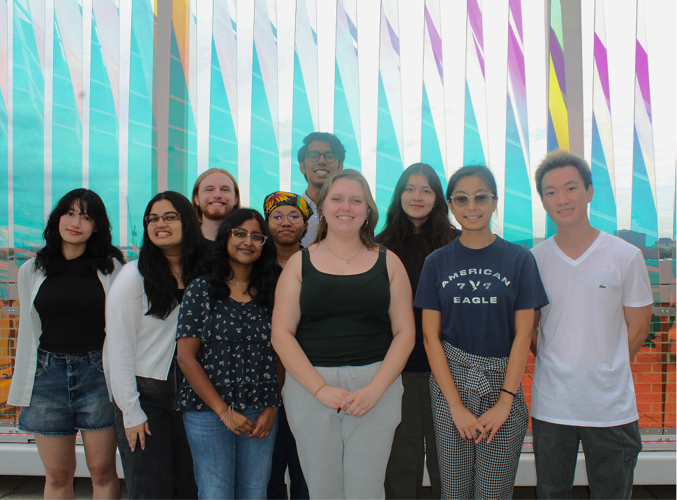
Web Team Picture